about sajeta
>> Sajeta Art and Music Festival is a festival and a place of encounter for various artistic practices and experiences with music as its central component. Although music presents a large part of the program, the spectrum of artistic forms at the festival is broader: film, multimedia, poetry, sculpture, performances, dance, and graphics among other have their place at the festival<<
SAJETA XXv 2024
SILVER ANNIVERSARY design in progress...


SAJETA XXIV 2023


Poster, line up an T-shirt for 24th Sajeta
SAJETA XXIII 2022


Posters and banners for 23rd Sajeta /butter can fly on Sajeta sky/
SAJETA XXII 2021


Poster and ad for "Wire".

T-shirts design.

FB ad.
SAJETA XXI 2020


Sajeta - project Continuum, web baners

New modern logo for Sajeta.


Exp. Art: Sajeta & MUST project & Grüntaler9 / BERLIN 2020.
SAJETA XX 2019


T-shirts XX


Posters for kid's Sajeta (Sajet'ca) and Sajeta XX.
SAJETA IXX 2018


SAJETA XVIII 2017

Ilustration for Sajeta design material, special 18th birthday (2017).


SAJETA 2016 / Javorca
This year topic was to create complex design which includes several related thimes:
100 years of Dadaism - 100 years of ‘Javorca’ church /church made for all religions/, where the main concerts will be held - emphasize the female creature, along with music and
natural, blue Sajeta environment
DESIGN
The main plan is a girl/woman, and the whole composition has a working title of Readymade Female. Her body floats, swims astonished by music from the gramophone. Birds flying freely. The music is created by animals as a natural association to Sajeta. Walrus with his tusk plays vinyl, the other one enjoys, deer plays saxophone ... There is the asparagus forest, because she eats a healthy food and monitor all trends of modern society. Right side follows little girl with a hat and a bag, going to the world "echoes from invisible landscapes". In that way, the main composition is associated with a concert in ‘Javorca’.
There is a small van, painted pink, for the record, a symbol of the freedom of her movement ...
Girl's body is connected with jellyfish (translucent floating freely being), her tits are speakers (this is the important part of the body that sets it apart as a female being, while music comes from her soul). Makeup, because it so necessary nowadays to be appreciated, that’s why her mouth and lipstick are so highlighted ... Her head is jellyfish’s body has with a flower on her head - dressed up and ready for the world ... readymade girl. Up right camera is rolling... In the background - water, blue, simply – Sajeta.


Poster for special Sajeta 2016.

Poster for main concert in Javorca church.

logo reDESIGN 2015
Meaning: in Slovenian "sajeta" means "arrow"
Task: logo redesign
Redesign is a sensitive but challenging topic. The challenge being - at the same time, retaining the visual characteristics of the old logo, while creating something new.
Mind process: The requirement is to create more solid, balanced and modernized logo while keeping free-spirited and nature-loving feel of the logo-mark (Sajeta being a creative camp based in natural setting).
Realization: Font is condensed, giving informal and natural look. The human figure is stronger, more visible, and connected to the title, becoming inseparable from it. The major characteristics have been kept - three hairs on it's head, the figure's position, and arrow. The arrow comprises a part of letter "T". The last letter "A" is turned upside down, which is associated with creative - "outside the box" - while at the same time it reminds of lodged tip of the arrow. The logo is clear, legible and recognizable, and can be reduced in size without the loss of legibility.
Left side - original logo since 1998.
Right side - new logo.

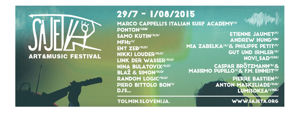
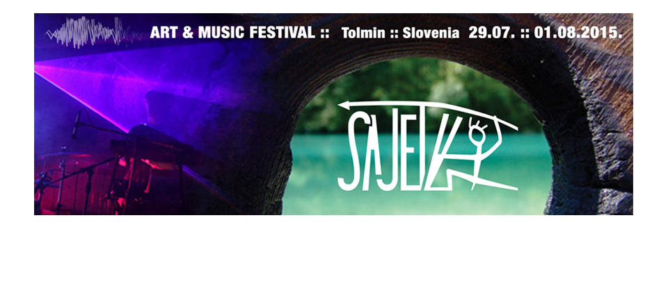
SAJETA 2015
The next step was to design visual identity for 2015 - to be used for social media pages, posters, flyers, billboards etc. The main theme for this year was decided on in discussions with client - so the accent was placed on electronic music. The river bank was also to be featured as an element, as camp is situated on a river bank.


AZBUKUM / CENTER FOR SERBIAN LANGUAGE AND CULTURE / NOVI SAD SERBIA
student textbooks, dictionary, ilustrations, classrooom branding, logos, posters, flyers etc.
SAJETA / ART&MUSIC FESTIVAL / TOLMIN SLOVENIA
logo redesign, logo design, visual identity for each year (since 2015) including web banners, flyers, posters, bilbords etc.
SARANTIS / CONSUMER PRODUCT COMPANY / BELGRADE SERBIA
design and KV adaptation
FOUNDATION ANA AND VLADE DIVAC / BELGRADE SERBIA
logo redesign, project visualisation, presentations etc.
OVSI / LOW-FAT CRECKER / BELGRADE SERBIA
packaging, web baners design, POS material, logo transformation, advertising ads, vehicle branding, shelfready boxes etc.
logo design, icon design for workshops, promo material - posters, fliers, web banners etc.
logo design, web presentation, promo material - posters, bookmarkers, invitations, bcards etc.
HAJDE DA RASTEMO / BELGRADE SERBIA
logo design, promo material - posters, bookmarkers, invitations, bcards etc.
logo redesign, product labels, web banners, ilustrations/drawing for textile printing

HIDROGEOEKO LOKAL 37 GEOMEHANIKA
graphic design | logo design | poster | billboard | flier | FB banners | interior/exterior branding | POS material | labels | magazines | advertising material | web presentation | business correspondence material | presentation etc.